Panels Without Borders: How Going Digital Is Rewriting the Grammar of Comics
There's a moment in nearly every great superhero comic where the story just stops being a story and becomes something closer to a painting. Superman punching through a mountain. A full spread of Galactus blotting out the sky. The final reveal of a villain standing over a burning city, rendered across two gorgeous pages with no panel borders, no captions, just pure visual impact hitting you like a freight train.
Now imagine reading that same moment on your phone.
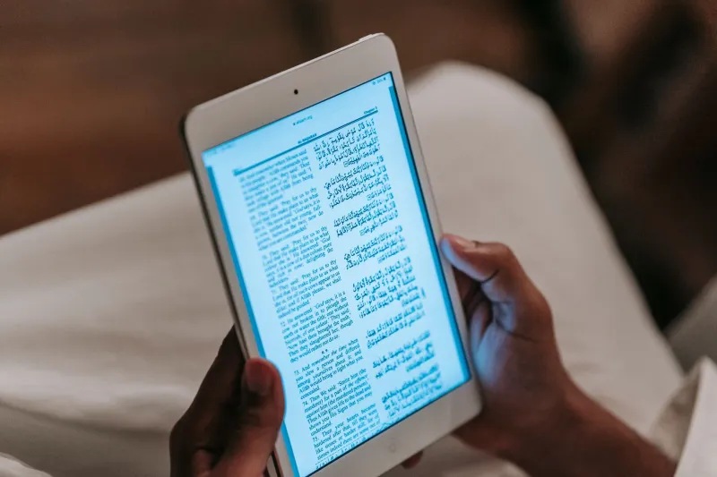
Suddenly you're pinching and zooming, trying to reconstruct something that was designed to be absorbed whole. The scale is gone. The drama deflates. What was supposed to be a gut-punch lands more like a polite tap on the shoulder. This is the quiet crisis at the center of comics' digital transition — and it goes a whole lot deeper than just screen size.
The Splash Page Was Never Just Decoration
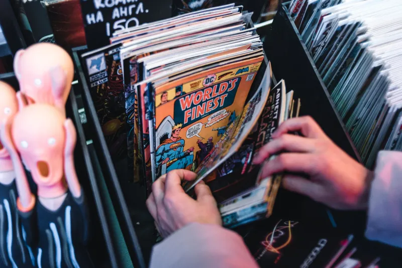
To understand what's at stake, you have to appreciate what the splash page actually does. It's not filler. It's not the artist showing off (well, not only that). The full-page or double-page spread operates as a kind of visual reset — a moment where the reader's pace is forcibly slowed, where the eye has room to wander and discover details, where the sheer physical size of the image creates emotional weight that no single panel can replicate.
Jack Kirby understood this instinctively. His Fourth World spreads weren't just big — they were overwhelming, and that overwhelm was the point. Jim Steranko's psychedelic layouts in the late '60s bent the page itself into a storytelling tool. Bill Sienkiewicz's painted spreads in Elektra: Assassin made readers feel genuinely unmoored. None of that works the same way when you're scrolling through a PDF on a tablet.
The problem isn't that digital screens are bad. It's that the splash page was engineered specifically for a physical object of a particular size. When that physical constraint disappears, so does a chunk of the technique's power.
What Digital Actually Broke (And What It Didn't)
Here's the thing that often gets lost in these conversations: not every print convention falls apart on a screen. Tight, dialogue-heavy sequences with smaller panels actually translate pretty cleanly. A lot of street-level superhero storytelling — your Daredevil alley fights, your Jessica Jones apartment confrontations — holds up fine at screen resolution because it was never relying on scale to begin with.
Colorists have arguably benefited from the shift. Print comics are forever at the mercy of cheap paper stock and inconsistent press runs. Digital delivery means colors appear exactly as the colorist intended, luminous and consistent, every single time. Colorists like Dave Stewart and Tamra Bonvillain have noted that digital readers often get a truer version of their work than print readers do.
Lettering is a more complicated story. Balloon placement that works perfectly on a physical page can crowd a smartphone screen in ways that make dialogue genuinely difficult to follow. Some letterers have started adapting their approach for digital-first releases, which then creates awkward gaps and empty space when those same issues go to print.
The Infinite Canvas Isn't a Gimmick Anymore
The most exciting response to all of this isn't trying to preserve print conventions on digital platforms — it's creators who've decided to abandon those conventions entirely.
The concept of the "infinite canvas" — originally articulated by webcomics pioneer Scott McCloud in the early 2000s — proposed that digital comics didn't need to be constrained by page dimensions at all. A story could scroll horizontally, vertically, diagonally, or in any direction the creator chose. For years this felt more like a thought experiment than a practical approach.
That's changing. Webcomic creators and digital-native publishers are building reading experiences that simply couldn't exist in print. Vertical scroll comics — enormously popular in South Korea through platforms like Webtoon — have exploded in the US market, particularly with younger readers who never had a strong attachment to the pamphlet format in the first place. Series like Lore Olympus and True Beauty have pulled in readerships that dwarf most traditional print titles, and they do it by designing for the phone screen rather than against it.
The visual language is genuinely different. Vertical scroll strips tend to use long, narrow panels that emphasize height and movement. Dramatic pauses are created by stretching empty space between panels rather than by expanding a single image outward. It's a different grammar, but it's a real grammar — not just print comics awkwardly reformatted.
Guided View and the Compromise Nobody Loves
Somewhere in the middle sits Guided View, the panel-by-panel navigation feature that ComiXology popularized before Amazon absorbed it into Kindle Unlimited and promptly made the whole thing more confusing. The idea was straightforward: instead of trying to view a full page on a small screen, readers move through individual panels in sequence, with the app handling the transition.
It's functional. It's also kind of a disaster for any comic that uses page layout as a storytelling device — which is to say, most interesting comics.
When you break a page into its individual panels, you lose the relationship between those panels. You lose the way a skilled artist uses negative space and panel size variation to control pacing. You lose the way a reader's eye naturally travels across a page, sometimes catching a crucial image in their peripheral vision before they're supposed to see it. Guided View turns a page into a slideshow, and slideshows don't do what comics pages do.
Creators know this. Many of them have started designing pages with Guided View specifically in mind, which means designing pages that work as sequences of discrete images rather than as unified compositions. Whether that's an adaptation or a loss probably depends on what kind of comics you grew up loving.
Where This Leaves Creators Right Now
The honest answer is that nobody has fully solved this yet. The creators navigating it best are the ones who've stopped trying to make one version of their work satisfy every delivery format and started making deliberate choices about which format they're actually designing for.
Digital-first series are embracing vertical scroll and infinite canvas approaches and finding real audiences. Print-focused creators are doubling down on the physical experience — bigger paper stocks, more luxurious production values — betting that readers who care about splash pages will pay for the format that delivers them properly.
What's probably not sustainable is the middle ground: comics designed for print that get reformatted for digital without any real adaptation, or digital-native work that gets collected into print volumes without acknowledging that the reading experience changes completely.
The splash page isn't dead. But it's learned something important about itself — it was always a product of a specific physical object, not an eternal truth about visual storytelling. What comes next might be less iconic, or it might be something we don't have the vocabulary to describe yet.
Either way, it's going to be interesting to watch.